
At a glance
OGSHIA is the statutory agency charged with delivering health insurance to every resident of Ogun State — pooling risk and resources so people can access quality care without being driven into financial hardship by medical bills. Established by state law in 2019, it runs a mandate that touches three very different audiences at once: residents who need to enrol and use cover, hospitals and clinics that need to become accredited providers, and field partners (Third-party Administrators) who register communities across every LGA.
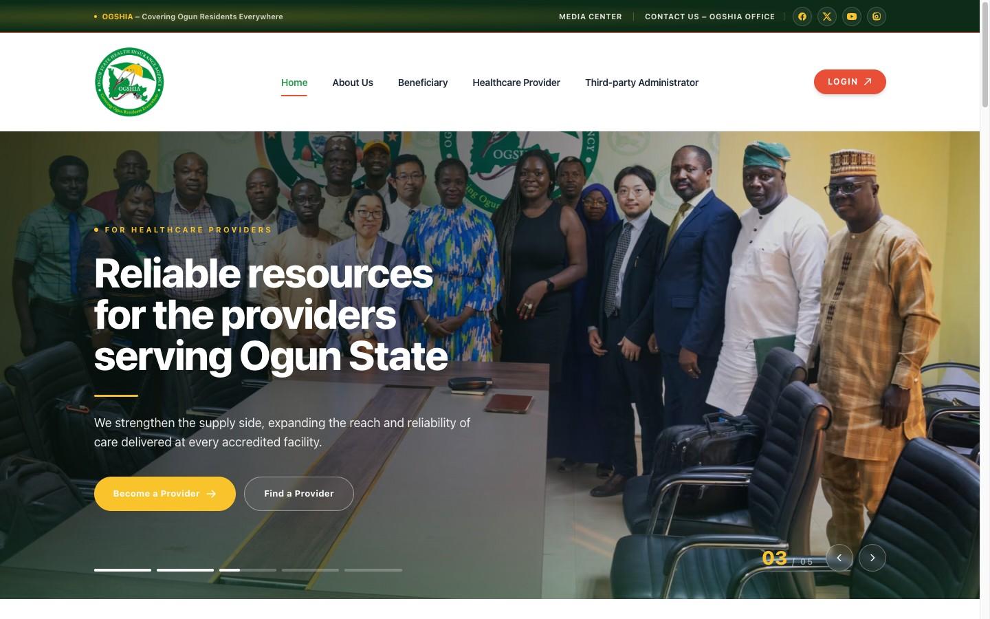
Inventrium designed and built ogshia.org — a ~19-page institutional platform with a five-slide hero, distinct stakeholder journeys for beneficiaries, providers and TPAs, online self-registration and partner-application routes, a benefits-and-schemes explainer, a payments route, and a CMS-driven media centre — migrating the agency’s content faithfully and re-skinning it in a calm, credible public-health identity.
We gave a state health-insurance agency a single trustworthy home that serves residents, providers and partners alike: clear enough for an enrollee, credible enough for a regulator, and structured to carry the whole mandate.
The brief
The agency was created in 2019 after the State House of Assembly passed the Health Insurance Bill and the Governor signed it into law, making health insurance a statutory commitment of the State. What began as a unit grew into a full agency, with a mandate rooted in social solidarity and equity: pool health risks and resources so that every resident — formal-sector worker, informal-sector trader, or vulnerable indigent — can access affordable, quality care.
A mandate like this lives or dies on reach, trust and clarity of action. The agency does not serve one audience; it serves three, each arriving with a completely different question:
- A resident needs to know: am I eligible, what does it cost, how do I enrol, and what is covered?
- A hospital or clinic needs to know: how do I become accredited, what are my responsibilities, and how do I apply?
- A Third-party Administrator needs to know: how do I partner with the agency to register enrollees across my LGAs?
The agency needed an official platform that could hold all three journeys without confusing any of them, route real actions to the right place, and read as the credible front door of a government health agency, while its operational back-office portals continued to live on the agency’s existing health-information system.
Objectives
- Project public-service credibility — an identity and architecture that read as official, calm and trustworthy for a government health agency.
- Serve three audiences clearly — distinct, self-evident journeys for beneficiaries, healthcare providers and Third-party Administrators from the first screen.
- Drive real action, not just information — route enrolment, provider accreditation, TPA application and premium payment to the right channel.
- Explain coverage in plain language — make eligibility, schemes, benefits, premiums and the waiting period understandable to a resident.
- Enable self-service publishing — let the agency post news and activities through a CMS without a developer.
- Migrate the live content faithfully — carry existing pages, documents and directories across without loss, and connect to the operational portals.
- Build for performance, longevity and maintainability — fast, discoverable, and structured to grow with the schemes and network.
What we did
A calm, credible public-health identity
We built a green-led identity — primary #279A4D with a #F9C32Cgold and an #E94F37 accent — on the Open Sans / Inter type system: warm and reassuring rather than clinical, signalling care and trust, and distinct from the generic blues most government sites default to. The brand treatment runs across every page so the same official, reassuring tone carries from the homepage hero to a payment-account card.
A multi-stakeholder information architecture
The core design problem — three audiences, one site — was solved at the architecture level. The top navigation splits cleanly into About Us, Beneficiary, Healthcare Provider, Third-party Administrator, Media Center and Contact, and a five-slide homepage hero rotates through the agency’s distinct value propositions, each with its own calls to action. A mission-vision block, an agency-activities ticker, an “our story” band, a stats summary and a news grid give a first-time visitor the full picture before they pick a path. The result is a ~19-page structure where every audience finds its lane immediately.
Three self-evident stakeholder journeys
Each audience hub is built from the same action-cards pattern, tuned to its own task:
- Beneficiaries get the enrolment story end to end — the four ways to enrol, the step-by-step process, premium (₦12,000 individual / ₦48,000 family) and the two-month waiting period — plus a Benefits Package page, a Beneficiary FAQs page, and routes into self-registration, accredited TPAs, the office and payment.
- Healthcare Providers get roles & responsibilities, minimum accreditation requirements, the application route, and the accredited-providers directory by tier.
- Third-party Administrators get their roles, accreditation requirements, a dedicated registration page (guideline + downloadable form), and the accredited-TPAs directory by Local Government Area.
Registration, application and payment routes
The site is deliberately action-oriented, and it is worth being precise about which step happens on the site and which hands off. A beneficiary self-registration page lets a resident start enrolment online, then explains the 48-hour biometrics follow-up that completes it off-site. Provider and TPA flows hand off to the agency’s existing operational portals for the formal registration and accreditation. The Make Payment page presents the correct Zenith Bank accounts (one for beneficiary premiums, one for HCP/TPA operations) with proof-of-payment instructions. Every audience page links to the right next step, so intent does not dead-end.
What this means in practice: we built and own the public website and the on-site start of each journey. The registration, accreditation and payment-settlement core stays with the agency, on its existing health-information system and bank accounts. The payments page lists accounts and collects proof of payment; it does not process or settle payments itself, and we do not operate the agency’s back office.
A coverage-and-schemes explainer
The dense policy content was made legible. An About page carries the agency’s history, departments, mission and vision; a Schemes page lays out the Formal, Informal, Vulnerable Group, BHCPF and “Sponsor an Indigent” schemes in plain language; and a Law Backing OGSHIA page makes the establishing Act downloadable.
A self-service media centre
News and agency activities are powered by Sanity CMS, so the agency’s team can publish press releases and field-activity updates without touching code. The homepage surfaces the latest items, while the Media Center page presents a fuller grid, giving the agency a self-service place to publish rather than a static announcements page. How current it stays depends on the agency posting to it.
Engineering, migration and maintainability
The site was built on Inventrium’s modular, section-based Next.js platform — hero-slider, action-cards, mission-vision, stats, news-grid, team-grid, map and more, assembled per page from a shared component library. The engagement migrated the agency’s stakeholder pages, document downloads and directories faithfully from the live WordPress site, then layered the premium homepage and hero/section overhaul on top.
Delivered and verified
- A ~19-page public front door covering the mandate, schemes, leadership, benefits, directories and contact.
- Three clear journeys under one roof: beneficiaries, providers and TPAs each get a self-evident path to the right next step.
- The routes themselves: an online beneficiary self-registration start, provider and TPA application routes that hand off to the agency’s operational portals, and a payments page listing the correct bank accounts with proof-of-payment instructions.
- Coverage made understandable: schemes, benefits, premiums, the waiting period and the establishing law explained in plain language.
- A self-service media centre the agency publishes news and activities to itself through Sanity.
- A faithful content migration on a maintainable foundation: the live site’s content and documents carried across cleanly and rebuilt on a modular platform.
What the agency approved: the three-audience site structure and the content migration plan were signed off before we built them.
How to judge the result
What we can show is the delivered platform and the journeys described above. Much of what the site starts, from enrolment to provider and TPA sign-ups and payments, completes on the agency’s own portals and bank accounts. So the clearest measure of impact is registrations started on the site against those completed, and that sits with the agency.
A reference for this engagement can be provided to a serious buyer, with the client’s permission.
What it means
For beneficiaries: the path to cover is clearer. A resident can read who is eligible, what it costs, what is covered and how to enrol, then start online or find the nearest TPA, PHC or office, with the off-site biometrics step spelled out rather than left as a surprise.
For providers & TPAs: a credible partner-facing front door. Hospitals see how to get accredited and what is expected of them; TPAs see how to apply and where they fit, with requirements, guidelines and forms in one place, before they move to the agency’s portal to complete it.
For the agency: a digital presence that matches a statutory mandate, plus the independence to keep content current. The platform consolidates three audiences, a document library and a newsroom into one maintainable home, and links cleanly to the existing operational portals without touching the back-office systems.
Strategically: the site supports the agency’s core purpose by making participation easier to understand and act on for every kind of stakeholder. Built on a modular platform, it can grow with new schemes, directories and partners rather than needing to be rebuilt.
Why it matters for Inventrium
This engagement demonstrates our ability to design for a multi-stakeholder public-service mandate — resolving three competing audiences into one coherent platform, wiring self-service registration, application and payment journeys, migrating a live government site faithfully, and standing up a maintainable CMS newsroom on a modern, performant stack.